
The Transformative Power of Your Home’s Exterior Color Palette
How to Choose the Right Exterior Color Palette for Your Home – The colors you select for your home’s exterior are arguably one of the most impactful design decisions you’ll make. They set the mood, tell a story, and can dramatically alter how your property is perceived. A well-chosen exterior color palette ideas can elevate your home from merely good to truly spectacular, while a misstep can diminish its charm and appeal.
Consider the profound effect of curb appeal. This isn’t just a real estate buzzword; it’s a tangible quality that contributes to your home’s welcoming nature. A beautiful exterior immediately signals care and quality, making your home more inviting to guests and more desirable to potential buyers. The colors you choose play the leading role in defining this curb appeal, making it a critical aspect of your home’s overall presentation.

Your home’s exterior also serves as a canvas for personal expression. It’s an opportunity to project your taste and personality onto the streetscape. Whether you lean towards classic elegance, modern minimalism, or vibrant charm, your color choices are a powerful tool for visual storytelling. This personal touch not only brings joy to you and your family but also makes your home stand out in a delightful way within the neighborhood.
Beyond personal preference, there’s the consideration of neighborhood harmony. While individual expression is important, respecting the aesthetic flow of your street or community can enhance everyone’s property values. A tasteful exterior color palette that complements the surrounding homes—without being identical—demonstrates consideration and contributes positively to the collective visual appeal of the area. It showcases your home uniquely while ensuring it fits seamlessly into the broader landscape, proving that thoughtful color selection transcends individual property lines.
Laying the Groundwork: Essential Factors for Your Exterior Color Choices
Before diving into swatches and shades, it’s crucial to understand the foundational elements that will inevitably influence your decision-making processes. These fixed, unchangeable, or contextual factors are the silent partners in your design journey, guiding your gaze towards the perfect exterior color palette ideas. Ignoring them can lead to choices that clash rather than coalesce, so a thorough assessment is key to a successful outcome.
Decoding Your Home’s Architectural Style and Era
Every architectural style carries with it an inherent design language, often expressed through specific forms, materials, and yes, color inclinations. Understanding your home’s architectural style is the first and most critical step in narrowing down your exterior color palette ideas.
- Victorian Homes: These intricate houses often thrive on multi-color schemes, highlighting their gingerbread trim, elaborate gables, and decorative details. Think jewel tones, muted historical colors, and contrasting trim work that accentuate their ornate features. A single, flat color would diminish their inherent complexity and historical grandeur.
- Craftsman Homes: Characterized by natural materials, earthy tones, and honest craftsmanship, Craftsman homes typically benefit from rich, grounded colors. Deep greens, warm browns, and ochres are often paired with cream or sage trim colors, reflecting their connection to nature and handmade aesthetic. The emphasis is on warmth and organic integration with the landscape.
- Modern and Contemporary Homes: These styles often favor clean lines and minimalist palettes. Greys, whites, blacks, and subtle earth tones are popular, often with a striking accent color on the front door or a specific architectural element. The focus here is on sophistication, simplicity, and creating a sleek, refined look that highlights form and function.
- Colonial Homes: Elegance and tradition define Colonial architecture. Classic white, muted blues, pale yellows, and soft greys are common, often paired with crisp white trim and dark shutters. The goal is to evoke a sense of timelessness, symmetry, and historical authenticity, maintaining a dignified and stately appearance.
- Mediterranean Homes: Terra cotta roofs are a defining feature, which naturally dictates warm, earthy color palettes. Stucco walls in sun-baked yellows, oranges, and soft browns, complemented by deep teal or azure accents, create the quintessential Mediterranean feel. These colors reflect the warmth and vibrancy of the regions that inspired this architectural style.
- Ranch Homes: Versatile and pragmatic, Ranch homes can support a wide array of colors. From classic neutrals to bolder, mid-century inspired hues, the key is often to enhance their horizontal lines and blend them thoughtfully with the landscape. Think about using a main color that grounds the home, perhaps a soft gray or a warm beige, with an interesting trim that provides a subtle lift.
Researching the historical appropriate exterior color palette ideas for your home’s specific style ensures authenticity while providing a fantastic starting point for personalization.
Acknowledging Fixed Elements and Their Undertones
Your home doesn’t exist in a vacuum; it’s anchored by fixed elements that possess their own inherent colors and undertones. These immovable features are non-negotiable and must be integrated harmoniously into your chosen palette. Overlooking them is a common mistake that can lead to discordant results.
- Roof Color: This is often the largest fixed element and acts as a major anchor. Whether it’s charcoal grey shingles, terra cotta tiles, or a weathered brown, your roof has a dominant color and subtle undertones (e.g., a grey roof might lean purple or blue). Your exterior paint colors must complement these existing hues to create a cohesive look.
- Driveway Materials: Concrete, asphalt, pavers, or gravel all have distinct colors. While often overlooked, the driveway connects to your home and influences the overall impression. Consider whether its tone is warm or cool and how that might interact with your chosen exterior color palette.
- Stone, Brick, or Siding Accents: Many homes feature natural stone foundations, brick facades, or existing siding sections that will remain. These materials are rich in varying colors and undertones. Before choosing a paint color, closely examine these elements to identify their dominant characteristics. Do they have pink, yellow, grey, or brown undertones? Your new paint color must either match these undertones or provide a pleasing contrast.
- Window Frames: If your window frames are aluminum, vinyl, or wood that won’t be painted, their color (white, black, bronze, wood tone) is another fixed point. These frames act as outlines for your windows and need to blend seamlessly or offer a deliberate visual break depending on your desired aesthetic.
- Existing Landscaping: While not “fixed” in the same way as brick, your mature trees, shrubbery, and garden beds do frame your home and add significant color. Consider the dominant greens, browns, and seasonal flower colors. A vibrant green landscape might call for a more subdued house color, while a starker environment might benefit from a color that adds warmth.
Understanding undertones is critical here. Colors are rarely “pure”; they tend to lean slightly warm (yellow, red, orange) or cool (blue, green, purple). A warm yellow brick will clash with a cool-toned grey paint. Spend time observing these fixed elements under different lighting conditions to truly grasp their underlying hues. This meticulous examination will reveal the subtle cues necessary for developing truly cohesive exterior color palette ideas.
Considering Climate and Geographic Location
The environment your home inhabits plays a surprisingly significant role in how exterior color palette ideas are perceived and how well they endure. From the intensity of sunlight to local traditions and even regulatory guidelines, these external factors are crucial to a successful outcome.
- Sun Exposure and Light Intensity: Colors appear differently under various lighting conditions. A color that looks perfectly subdued on a paint chip in a dim store might appear glaringly bright under direct, intense sunlight in a warm climate. Conversely, a deep, rich color might look dull and flat in a perpetually overcast region.
- Bright Climates (e.g., Desert, Coastal): Lighter, softer colors often work well, as they prevent homes from absorbing too much heat. Whites, pale blues, and sandy beiges reflect sunlight and help keep interiors cooler. Very dark colors can absorb heat, fading faster and potentially increasing cooling costs.
- Overcast Climates (e.g., Pacific Northwest, Northern Europe): Deeper, more saturated colors can provide a welcome visual warmth and prevent homes from looking washed out. Rich greens, deep blues, or warm greys can appear vibrant and inviting even on gloomy days.
- Local Regulations and HOA Rules: Many communities, especially those with homeowner associations (HOAs) or historical districts, have specific guidelines or approved color palettes. Before falling in love with a bold hue, always check with your HOA or local planning department to ensure your choices are permissible. This step can save you significant time, money, and potential heartache.
- Regional Traditions and Natural Surroundings: Certain regions have established aesthetic norms or inspirations from their natural landscapes.
- Coastal Areas: Often feature light blues, sandy whites, and muted greens, evoking the sea and sky.
- Mountain Regions: Earthy tones like deep greens, browns, and natural wood stains blend seamlessly with the forested backdrop.
- Desert Climates: Tend towards sun-baked adobe tones, terracotta, and soft, muted desert florals.
- Farmhouse Style: Often embraces classic whites, creams, muted greys, and barn red accents, reflecting rustic charm.
By integrating these climatic and geographic considerations into your initial planning, you ensure that your chosen exterior color palette ideas not only look fantastic on paper but also perform beautifully and contextually in the real world, standing the test of time and environment.

Mastering the Art of Color Selection: A Step-by-Step Guide
With the foundational understanding established, it’s time to delve into the exciting process of actually choosing your colors. This phase requires a blend of inspiration, experimentation, and an understanding of how colors interact to form cohesive exterior color palette ideas. Approach this section with an open mind and a willingness to explore, knowing that the perfect palette is within reach.
Researching and Gathering Inspiration
The world is a vibrant source of exterior color palette ideas. Before you even pick up a paint chip, immerse yourself in visual research. This initial exploration can help you identify what you love, what you dislike, and what truly resonates with your home’s potential.
- Online Inspiration Boards (Pinterest, Houzz): These platforms are treasure troves of home design. Search for “exterior home colors,” “curb appeal ideas,” or specifically “exterior color palette ideas for [your home style].” Pin images that catch your eye, looking for recurring themes or specific combinations that you find appealing. Pay attention not just to the body color, but also how trim, doors, and other elements interact.
- Neighborhood Exploration: Take a walk, drive, or bike ride through your own neighborhood and surrounding areas. Observe homes with similar architectural styles to yours. What color schemes work well? What draws your eye? What combinations feel wrong? Document these observations with photos (respectfully, of course) and notes. This real-world perspective is invaluable.
- Paint Company Websites and Blogs: Major paint brands (Sherwin-Williams, Benjamin Moore, Behr, Valspar, etc.) invest heavily in color trend forecasting and inspiration. Their websites often feature curated exterior color palette ideas, style guides, and even visualization tools that allow you to “paint” virtual homes. Look at their historical collections for classic styles or their trend reports for fresh interpretations.
- Magazines and Books: Home and garden magazines, as well as interior design books, often showcase stunning exteriors. These provide high-quality visual examples and professional insights into effective color pairings and architectural harmony.
- Nature as Your Muse: Nature offers an endless supply of perfect palettes. Think about the colors of a sunset, a forest in autumn, a rocky beach, or a desert landscape. These natural compositions are inherently harmonious and can provide unique exterior color palette ideas that feel grounded and timeless.
- Creating a Mood Board: Once you’ve gathered a collection of images, colors, and textures that inspire you, assemble them into a physical or digital mood board. Include swatches of potential paint colors, photos of homes you admire, material samples (if relevant), and anything else that captures the desired aesthetic. This visual summary will help solidify your vision and ensure all elements coalesce into a unified theme.
Exploring Color Families and Their Psychology
Colors evoke emotions, perceptions, and even practical responses. Understanding basic color psychology and how different color families interact is fundamental to crafting an effective exterior color palette ideas. This knowledge allows you to intentionally create a specific feeling or ambiance for your home.
- Warm Colors (Reds, Oranges, Yellows):
- Psychology: Energetic, inviting, stimulating, cozy, joyful.
- Exterior Impact: These colors tend to advance visually, making homes appear closer or larger. They can create a welcoming, vibrant atmosphere. Red doors are traditionally seen as symbols of hospitality. Overuse can be overwhelming; best used as accents unless a specific architectural style (like Spanish Colonial) dictates otherwise.
- Examples: Terracotta, goldenrod, brick red, warm cream.
- Cool Colors (Blues, Greens, Purples):
- Psychology: Calming, serene, refreshing, sophisticated, contemplative.
- Exterior Impact: Cool colors tend to recede, making homes feel more distant or smaller. They blend beautifully with natural landscapes and can create a tranquil, harmonious look. Often used to create a sense of dignity or classic appeal.
- Examples: Sage green, navy blue, dusty lavender, cool grey-blue.
- Neutrals (Whites, Greys, Beiges, Browns):
- Psychology: Timeless, versatile, sophisticated, stable, enduring, clean.
- Exterior Impact: Neutrals are the backbone of many successful exterior color palette ideas. They provide a stable canvas, allowing fixed elements or landscape to shine. They are excellent for creating a timeless, elegant look and offer diverse undertones (warm beige, cool grey) that subtly shift their character. Neutrals are highly forgiving and pair well with almost any accent color.
- Examples: Off-white, charcoal grey, greige, tan, chocolate brown.
The Power of Neutrals: Timeless Choices
Neutrals are the unsung heroes of many stunning exterior color palette ideas. Far from being boring, they offer unparalleled versatility and a foundation for timeless elegance.
- Whites: Crisp, clean, expansive. They reflect light beautifully and can make a home feel larger and more open. From pure brilliant white to creamy off-whites with subtle yellow or grey undertones, there’s a white for every style. They pair perfectly with virtually any accent color and are a classic for Colonial and Farmhouse styles.
- Greys: Modern, sophisticated, calming. Greys range from warm greiges (grey + beige) that blend well with traditional styles, to cool charcoals that deliver a dramatic contemporary punch. Greys can be incredibly versatile, acting as a sophisticated backdrop for pops of color or standing alone for a sleek aesthetic.
- Beiges and Tans: Warm, inviting, natural. These colors echo the earth and sand, making them feel grounded and harmonious with natural surroundings. They are softer than pure white and provide a cozy feel. They are excellent choices for homes with natural stone or wood elements, providing a complementary warmth.
- Browns: Rich, earthy, stable. Deep browns can mimic natural wood and create a sense of solidity and warmth. They are particularly effective for Craftsman homes or those nestled in wooded areas, contributing to a cozy, grounded feel.
The beauty of neutrals lies in their ability to be both subtle and impactful. They provide excellent flexibility for future changes in landscaping or decor, ensuring your exterior remains elegant for years to come.
Bold Accents and Harmonious Combinations
While neutrals provide the canvas, bold accents add personality and highlight your home’s unique features. The trick is to use them strategically and harmoniously within your chosen exterior color palette ideas.
- Front Door: This is often the prime spot for an unexpected pop of color. A bright red, a vibrant teal, a sunny yellow, or a deep navy can instantly draw the eye and create a welcoming focal point. The front door is an easy and relatively inexpensive element to repaint if you ever want to change its look.
- Shutters: Shutters offer another opportunity for accent color. Traditionally, they either match the trim or provide a contrasting dark color (like black or deep green) against a lighter body. Consider how their color enhances or contrasts with the main body paint.
- Window Boxes and Planters: These aren’t permanent paint colors but contribute significantly to the overall color scheme. Their colors, both the materials and the plants within, can tie into your accent colors or introduce seasonal vibrancy.
- Architectural Details: Gables, eaves, unique trim work, or a specific architectural panel can be highlighted with a contrasting or complementary accent color. This draws attention to the craftsmanship and character of your home.
When combining colors, think about the 60-30-10 rule often used in interior design, which can be adapted for exteriors:
- 60% Dominant Color: The main body of your house.
- 30% Secondary Color: Often the trim, shutters, or a porch ceiling.
- 10% Accent Color: The front door, possibly window sashes, or other small details.
This rule provides a balanced framework, ensuring one color doesn’t overwhelm the others and that the overall effect is pleasing and cohesive. Experiment with different ratios and color placements to find the perfect harmony for your home.
Crafting Your Perfect Exterior Color Palette: Beyond the Main Hue
An exceptional exterior color palette ideas extends far beyond a single house color. It’s a symphony of hues, where the main body, trim, accents, and features like the front door and garage door all play their part in creating a unified and visually appealing composition. Each element offers an opportunity to refine and enhance your home’s character.
The Main Body Color: Your Home’s Grand Canvas
Choosing the main body color is perhaps the most significant decision, as this hue will dominate your home’s facade. It sets the overarching tone and influences how all other colors will be perceived. This is where your thorough research into architectural style, fixed elements, and color psychology truly pays off.
- Consider Light Reflectance Value (LRV): Every paint color has an LRV, a number from 0 (absolute black) to 100 (absolute white) that indicates how much light it reflects.
- High LRV (Lighter Colors): Reflect more light, making a home appear larger, brighter, and cooler. They are popular in sunny climates to reduce heat absorption.
- Low LRV (Darker Colors): Absorb more light, making a home appear cozier, more grounded, and potentially smaller or more dramatic. They can make features pop and are fashionable for modern homes.
- Understanding LRV helps you select a color that not only looks good but also performs practically in your specific climate and light conditions. A dark color in a very hot climate might lead to higher cooling bills.
- Observe Colors in Natural Light: A paint chip in a store will look entirely different when painted on your home’s exterior. Colors shift dramatically based on natural light, time of day, and weather conditions. What looks like a soft grey indoors might appear blue or even purple outside, while a warm beige could turn dull.
- Balance Contrast and Harmony: Decide if you want a high-contrast look (e.g., dark body with stark white trim) or a more harmonious, low-contrast scheme (e.g., muted body with slightly lighter trim in the same color family). Both can be stunning depending on your home’s style and your personal preference for exterior color palette ideas. High contrast can highlight architectural details, while low contrast creates a softer, more integrated appearance.
- Don’t Be Afraid of the “Wrong” Color: There’s no single “wrong” color, only colors that don’t quite fit your vision or your home’s context. Embrace the process of elimination. If a color doesn’t feel right after sampling, move on. The right color will eventually click into place, tying all your exterior color palette ideas together.
Trim and Accent Colors: The Supporting Cast
Once the main body color is selected, attention shifts to the trim and accent colors. These elements outline your home’s features, providing definition and enhancing its architectural beauty. They are the secondary players that make the star truly shine.
- Trim (Windows, Door Frames, Fascia, Soffits, Corner Boards):
- Classic White: A timeless choice that creates crisp definition and makes colors pop. It’s especially effective with dark body colors for striking contrast or with lighter colors for a fresh, clean look.
- Complementary Neutrals: Using a slightly lighter or darker shade of your body color, or a related neutral (e.g., a warm grey trim with a cool grey body), creates a softer, more sophisticated transition than pure white. This approach results in harmonious exterior color palette ideas.
- Bold Accent Trim: In some eclectic or carefully planned schemes, trim can be a bold accent color. This is less common for an entire house but can be used on specific elements, like colorful window sashes against a neutral frame and body.
- Soffits and Eaves: Often neglected, these areas usually match the trim color to create a continuous line and make the roofline appear lighter. Sometimes, they might match the body color for a more monolithic look, particularly on modern homes.
- Railings and Porch Pillars: These are typically painted the trim color, but can sometimes match the main body if the goal is to make them less visually assertive. On a stately home, painting pillars a contrasting color can create a grander effect.
When selecting trim and accent colors, think about making them work in concert with the main house color. Do you want them to pop and draw attention to architectural lines, or do you prefer them to blend seamlessly and create a softer, more cohesive facade? The answer depends on your home’s style and the overall impact you wish to achieve with your exterior color palette ideas.
Front Door and Shutter Colors: The Statement Makers
The front door and shutters are prime opportunities to inject personality and make a bold statement within your exterior color palette ideas. These smaller areas allow for more daring choices without overwhelming the entire house.
- The Front Door: A Welcoming Beacon:
- Bold Contrast: Paint your front door a vibrant color that dramatically contrasts with the main body and trim. A red door on a grey house, a bright yellow door on a navy house, or a deep teal on a white house are captivating and inviting.
- Harmonious Accent: Choose a color that is a deeper, richer version of a color found elsewhere in your palette, or a complementary shade. For example, a deep forest green door on a sage green house, or a charcoal door on a light grey home.
- Timeless Elegance: Black or dark wood-stained doors always exude sophistication and class, especially on traditional homes.
- Reflecting Your Personality: This is where you can truly let your personality shine. The front door is a relatively small surface, making it easy to repaint if you ever want a change. It’s an inexpensive way to update your curb appeal and allows for constant evolution of your exterior color palette ideas.
- Shutters: Framing Your Views:
- Matching Trim: Often, shutters are painted the same color as the window trim for a unified look. This creates a clean frame around the windows.
- Darker Contrast: A classic choice is to use a dark, contrasting color for shutters (e.g., black, deep navy, forest green) against a lighter body color. This provides definition and a traditional charm.
- Subtle Blends: On some homes, shutters can be painted a slightly different shade of the body color for a softer, more integrated effect. This works well for homes where a less stark contrast is desired.
- Highlighting Period Details: On homes like Victorians, shutters might be part of a multi-color scheme to highlight their intricate details.
When combining front door and shutter colors within your exterior color palette ideas, consider the interplay. Do you want both to make a statement, or should one recede while the other pops? The goal is to create visual interest and emphasize key architectural features without creating a chaotic appearance.
Deck, Porch, and Garage Door Considerations
These often-overlooked elements are crucial to a complete and harmonious exterior color palette ideas. They form significant visual blocks and must be integrated thoughtfully to prevent a disjointed look.
- Garage Door:
- Blending In: The most common and often recommended approach is to paint the garage door the same color as the main body of the house. This makes it visually recede, allowing your front door, gardens, or other architectural features to become the focal point. This is especially important if your garage door faces the street and is a prominent feature.
- Matching Trim: If your home’s design features strong trim lines, sometimes matching the garage door to the trim color can work, particularly if the trim is a neutral color that complements the body.
- Wood Look: For certain architectural styles (e.g., Craftsman, Spanish Colonial, some modern farmhouses), a high-quality faux wood or real wood garage door adds a rich texture and complements warm exterior color palette ideas.
- Avoid Contrasting Colors: Generally, avoid painting your garage door a starkly contrasting color to the house body. This can make the garage door appear too dominant and detract from your home’s entrance.
- Decks and Porches:
- Deck Stains: Wooden decks and porches are typically stained rather than painted, allowing the wood grain to show through. Choose stains that complement your overall exterior color palette ideas—think warm browns, greys, or even natural clear sealers.
- Painted Porch Floors/Ceilings: Porch floors can be painted a sturdy, durable color that grounds the space, often a darker neutral (like grey or dark tan). Porch ceilings, especially on traditional homes, are sometimes painted a light “haint blue,” a Southern tradition believed to ward off spirits and mimic the sky. This is a charming accent that adds a subtle cool color to the palette.
- Railings and Spindles: These usually match the house trim or the main body color, or are stained to match the deck/porch floor, depending on the desired visual continuity.
By giving careful consideration to these “secondary” elements, you ensure that your exterior color palette ideas are comprehensively planned. Every surface contributes to the overall aesthetic, creating a feeling of thoughtful design and visual coherence from top to bottom.
Practical Strategies for Testing and Finalizing Your Palette
Even with the most meticulous planning, the true test of your exterior color palette ideas comes when the colors are applied. Paint colors behave differently on a large scale and under natural light than they do on a small swatch. This crucial phase involves testing, observing, and potentially adjusting your choices to ensure absolute satisfaction.
The Undeniable Importance of Swatching
Do not underestimate the power of large-scale swatching. A tiny paint chip is simply not enough to accurately judge how a color will look on your home’s exterior. The sheer area coverage, the angle of the sun, and the surrounding environment will profoundly alter the color’s appearance.
- Purchase Sample Pots: Many paint companies offer small sample pots (often quarts or pints) of their colors. Buy samples of your top 2-3 main body color contenders, and 1-2 trim/accent options.
- Paint Large Boards: Don’t paint directly onto your house facade immediately. Instead, purchase large pieces of wood or poster board (at least 2×2 feet, larger if possible). Paint two full coats of each sample color onto separate boards. This provides a substantial surface area to observe the color realistically.
- Observe in Various Locations and Times: Place these painted boards against different sections of your house – sun-exposed areas, shaded areas, near fixed elements like brick or stone.
- Morning Light: Often cooler and brighter.
- Mid-day Light: Most intense and direct, can wash out colors.
- Afternoon/Evening Light: Warmer, bringing out yellow and red undertones.
- Overcast Days: Reveals the truest, least-affected version of the color.
Observe how the colors interact with your roof, landscaping, and neighboring homes. Take photos in different lighting conditions to compare.
- Live with the Colors: Leave the sample boards up for several days, living with them as you go about your daily routine. Step back from the street, and get a feel for how they truly integrate into the environment. Often, a color you loved on a chip will look jarring on a large scale, or a color you were unsure about will surprisingly shine. This experimentation is vital to refining your exterior color palette ideas and avoiding costly repainting.
Observing Colors Throughout the Day and Season
As highlighted in the swatching stage, light is the ultimate dictator of color perception. The very same paint color will transform throughout the day, depending on the sun’s position, the weather, and even seasonal changes in foliage.
- Morning vs. Evening: Colors will generally appear cooler and crisper in the morning light, often revealing blue or green undertones. As the sun sets, light becomes warmer and more golden, enhancing red and yellow undertones, and making colors feel richer.
- Bright Sun vs. Overcast Skies: Direct sunlight can make colors appear lighter and brighter, potentially washing out subtle nuances. Under an overcast sky, colors will appear truer and deeper, revealing their full saturation.
- Seasonal Changes: Lush summer greenery can make a deep green house blend in, while the same color might stand out more dramatically against a barren winter landscape. Consider how your chosen exterior color palette ideas will look year-round.
- Reflection from Surroundings: Nearby elements like a bright green lawn, a red brick pathway, or even a neighbor’s brightly colored house can reflect light onto your home and subtly alter the perceived color. Watch for these interactions.
This careful observation phase helps you select a color that looks good not just at one moment, but consistently throughout the typical conditions your home experiences. It ensures that your finalized exterior color palette ideas are robust and beautiful in all settings.
Seeking Professional Advice: When to Call in the Experts
While a DIY approach to color selection is entirely possible, there are times when seeking professional assistance can be an invaluable investment, especially when dealing with complex homes, historical accuracy, or if you’re feeling overwhelmed.
- Color Consultants: These specialists focus exclusively on color. They have an expert understanding of color theory, undertones, and how light affects perception. They can help navigate your home’s fixed elements, architectural style, and your personal preferences to curate custom exterior color palette ideas. They often use large color swatches and digital tools to help you visualize options.
- Architects or Architectural Designers: If you’re undertaking a major renovation or have a historically significant home, an architect can provide guidance on period-appropriate colors and ensure your choices enhance the home’s architectural integrity. They can provide a holistic design perspective.
- Interior Designers with Exterior Experience: Many interior designers also have a strong grasp of exterior aesthetics. If you’ve worked with one for your interiors and trust their eye, they can often extend their expertise to your home’s exterior to ensure a cohesive overall property aesthetic.
- Professional Painters: While not color consultants, experienced painters often have practical knowledge of how certain paints perform, how colors look on different surfaces, and can offer insights into the durability and application of various finishes. They might have seen thousands of exterior color palette ideas in action.
A professional can offer an objective eye, save you from costly mistakes, and provide a range of creative exterior color palette ideas you might not have considered on your own. Their expertise can be particularly beneficial if you’re struggling to harmonize challenging fixed elements or if you have specific aesthetic goals that require a nuanced approach.
Utilizing Digital Visualization Tools
The advent of technology has provided powerful tools to help homeowners visualize exterior color palette ideas before committing to paint. These digital resources can be a fantastic step after initial swatching and observation.
- Online Paint Visualizers: Most major paint brands offer online tools where you can upload a photo of your own home and virtually “paint” it with different colors. While not perfectly accurate (colors on screen vary), these visualizers offer an excellent way to see how various combinations of body, trim, and accent colors could look on your unique facade. They help you quickly cycle through numerous exterior color palette ideas without lifting a brush.
- Photo Editing Software: For those with graphic design skills, you can use software like Photoshop or GIMP to digitally paint your home. This offers greater precision and control over color application, allowing you to experiment with intricate details and custom shades.
- Curb Appeal Apps/Services: Some apps and online services specialize in exterior design visualization. You upload a photo, and their designers or AI tools provide rendered suggestions for paint colors, landscaping, and even material changes. These can offer professionally curated exterior color palette ideas and comprehensive design concepts.
Digital tools are fantastic for narrowing down choices and seeing the big picture. However, always remember to back up your digital decisions with physical samples. Screen colors are not true-to-life, and nothing beats seeing the paint on a real surface under natural light before making your final commitment to specific exterior color palette ideas.
Beyond the Ordinary: Inspiring Exterior Color Palette Ideas
Now that you’re equipped with the knowledge and strategies for selection, let’s explore some inspiring and popular exterior color palette ideas. These examples demonstrate how different combinations can achieve distinct looks, from timeless elegance to modern flair, and can serve as a springboard for your own creative journey.
Classic and Timeless Combinations
These palettes are perennially popular for a reason: they offer enduring beauty and broad appeal, often enhancing traditional architectural styles. They represent safe yet sophisticated choices when considering various exterior color palette ideas.
- Crisp White with Black Accents: A quintessential combination. A brilliant white body provides a fresh canvas, while crisp black (or charcoal) on shutters, window frames, and the front door offers dramatic contrast and sophistication. This timeless pairing shines on Colonial, Farmhouse, and even some Modern homes.
- Soft Grey with White Trim and a Pop of Color: Muted greys (warm greige or cool stone grey) are incredibly versatile. Paired with clean white trim, they create a sophisticated, understated backdrop. A vibrant front door (e.g., deep red, sunny yellow, or electric blue) then becomes an arresting focal point, adding personality without overwhelming the classic base.
- Navy Blue with White Trim and Red Door: Evoking coastal charm and Americana, deep navy is a striking body color that feels both bold and classic. White trim provides a crisp contrast, while a classic fire-engine red front door adds a vibrant, patriotic punch. This works wonderfully for Cape Cod, Coastal, and Traditional homes.
- Sage Green with Cream Trim and Wood Elements: Sage green offers a peaceful, earthy elegance that blends beautifully with natural surroundings. Paired with soft cream or ivory trim, it creates a gentle, harmonious look perfect for Craftsman, Cottage, or Ranch-style homes. Natural wood elements on the porch or door further enhance its organic appeal, making it a soothing choice for exterior color palette ideas.
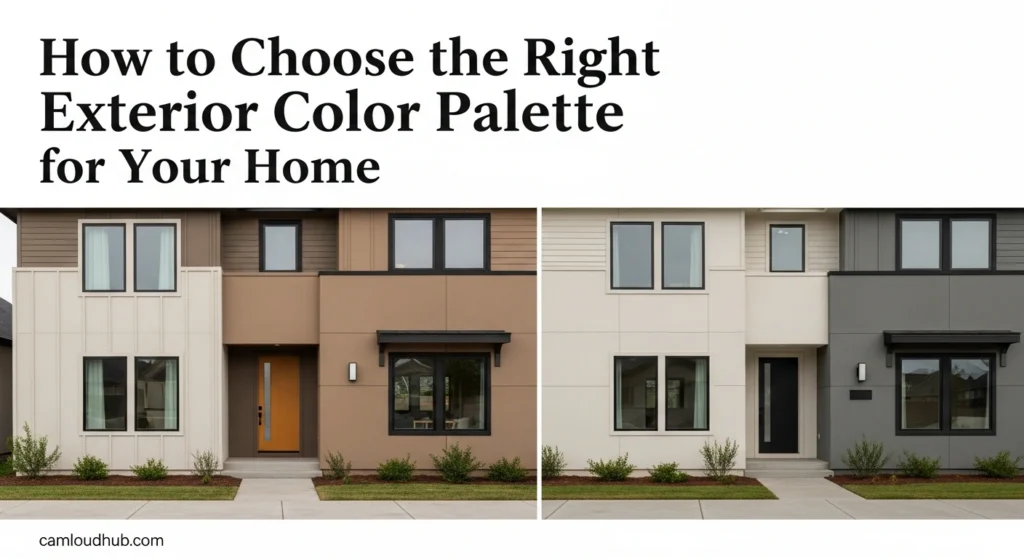
Modern and Contemporary Palettes
For homes with sleek lines and minimalist aesthetics, contemporary exterior color palette ideas often embrace restraint, drama, and textural contrast.
- Monochromatic Greys (Dark to Light): A sophisticated approach using varying shades of grey. A deep charcoal or slate grey body paired with a lighter grey trim and perhaps a very dark grey front door creates a seamless, chic, and urban look. This emphasizes form and texture over bright colors.
- Dramatic Dark Hues with Natural Wood and Black Trim: Deep blues, forest greens, or even true black bodies create a striking, grounded presence. These dark hues are stunning when contrasted with warm-toned natural wood siding or accents, and sharp black trim around windows. This creates a modern, luxurious, and often moody aesthetic.
- White with Black Windows and Industrial Accents: A crisp white exterior serves as the backdrop for bold, black-framed windows, a signature of modern design. Metal accents (stainless steel, concrete, or dark grey panels) add to the industrial-chic appeal, creating striking exterior color palette ideas that are both clean and edgy.
- Warm Desert Tones with Cinderblock and Succulents: Drawing inspiration from arid landscapes, this palette uses sun-baked beiges, muted pinks, and terracotta hues, often on stucco or textured surfaces. Paired with exposed cinderblock or concrete elements and natural desert-friendly landscaping, it creates a unique, earthy modernism.
Bold and Expressive Choices
Sometimes, a home just needs to stand out. Bold exterior color palette ideas are about intentional vibrancy and confident expression, demanding attention in the best possible way.
- Vibrant Teal/Aqua with White and Coral Accents: For homes near water or those seeking a playful, retro vibe, a rich teal or bright aqua body color can be incredibly charming. Paired with crisp white trim, and a pop of unexpected coral or orange on the front door, this palette is cheerful and full of personality.
- Sunny Yellow with White Trim and Grey Roof: A cheerful and welcoming choice, a soft, sunny yellow can brighten any streetscape. Paired with classic white trim and a grounding grey roof, it evokes warmth and optimism. This works particularly well on Victorian cottages or traditional homes looking for a joyful update.
- Deep Plum/Eggplant with Chartreuse or Gold Accents: An unconventional yet sophisticated choice, deep plum offers a rich, luxurious feel. Contrasted with unexpected chartreuse green on the front door or a subtle metallic gold accent, it creates a highly unique and artistic statement, perfect for a homeowner who truly embraces individuality in their exterior color palette ideas.
- Warm Orange/Rust with Deep Green and Earthy Stone: Bold and grounded, a rich orange or deep rust hue can evoke warmth and a connection to nature. When paired with deep forest green trim or window frames and rugged stone elements, it creates a robust and inviting presence, reminiscent of Mediterranean or Southwestern styles.
Integrating Natural Elements
Many successful exterior color palette ideas are inspired by the surrounding environment, blurring the lines between the built structure and the natural world.
- Earthy Greens and Browns with Natural Wood: Mimicking a forest landscape, this palette uses varying shades of green (from moss to deep evergreen) and brown (from tan to chocolate) for the body and trim. Abundant natural wood siding, decking, or cedar shingle elements complete the look, making the home feel like it grew out of its setting.
- Coastal Blues and Greys with Sandy Neutrals: Drawing from beach environments, soft blues (sky, seafoam) and muted greys (storm cloud, driftwood) are often paired with sandy beiges or crisp whites. This creates a serene, breezy, and relaxed feel, perfect for coastal homes or those wanting a tranquil escape.
- Stone and Stucco with Muted Hues: When stone or stucco are dominant features, the paint colors should complement their natural textures and tones. Muted versions of warm greys, soft tans, or creamy off-whites allow the natural materials to be the star, creating a grounded and textural exterior color palette ideas. Adding deep terracotta or olive accents can further enhance the organic feel.
Regional-Specific Exterior Color Palette Ideas
Certain geographical regions and architectural styles have developed distinctive color traditions that are worth exploring.
- New England Charm: Think classic whites, deep blues (navy, cadet blue), muted greens (sage, olive), and cranberry reds for doors or shutters. These colors reflect the maritime history and traditional architecture of the region.
- Tuscan/Mediterranean Warmth: Dominated by sun-baked earth tones—terracotta, golden yellows, peach, and muted ochres for stucco. Deep azure or teal often appears on doors or decorative tiles, contrasting beautifully with the warm base.
- Southwestern Vibrancy: Inspired by desert landscapes and indigenous cultures, this palette features adobe reds, warm oranges, dusty browns, and turquoise or vibrant blue accents. These bold yet natural hues reflect the strong sunlight and unique ecology of the Southwest.
- Pacific Northwest Naturalism: Emphasizes integration with lush, often rainy, landscapes. Deep greens, cool greys, rich browns, and natural wood stains are prevalent. Homes often blend into their surroundings, seeking harmony with dense forests and muted skies.
No matter your personal style or architectural type, these exterior color palette ideas serve as a rich source of inspiration. Remember to always test samples and consider your unique home’s context before making a final decision.
Avoiding Common Exterior Color Mistakes
Choosing the perfect exterior color palette ideas involves not just knowing what to do, but also what to avoid. Steering clear of these common pitfalls can save you time, money, and ensure a result you’ll love for years to come.
- Ignoring Fixed Elements: This is perhaps the biggest mistake. Forgetting to factor in your roof color, bricks, stone accents, or existing window frames can lead to clashes that are expensive to fix. Your paint colors must harmonize with these unchangeable features.
- Choosing Color in Isolation: Never select a main body color, trim color, and accent color totally independently. They must work as a unified composition. An otherwise lovely color might look terrible when paired with another if their undertones conflict or one overwhelms the other.
- Underestimating the Impact of Light: As discussed, paint colors change dramatically under different lighting conditions. Picking a color based solely on a small swatch in a store, or a single observation at one time of day, is a recipe for disappointment. Always swatch large and observe widely.
- Too Many Colors: While some architectural styles (like Victorian) can support multi-color schemes, most homes benefit from a restrained palette, typically 3-4 colors (main body, trim, accent, and possibly a door color). Too many competing colors can make a home look busy, cluttered, and detract from its architectural features.
- Disregarding the Neighborhood Context: While your home is unique, it exists within a community. Choosing a color that drastically clashes with the overall aesthetic of your street or neighborhood can negatively impact curb appeal and property values, even if you love the color in isolation. Aim for harmony, not necessarily uniformity.
- Falling for Fleeting Trends: While trends can offer fresh exterior color palette ideas, choosing a color solely because it’s popular right now might lead to regret in a few years. Seek timeless appeal or carefully integrate trendy elements into a classic foundation. Trends in exterior paint typically have a longer cycle than interiors.
- Overlooking Paint Sheen: The finish of your paint (flat, satin, semi-gloss) also affects how color is perceived and how durable it is. Flat finishes hide imperfections but can look dull; satin is a popular choice for durability and subtle sheen; semi-gloss is often used for trim and doors to highlight details and for easier cleaning. Don’t let your perfect exterior color palette ideas be dulled by the wrong sheen.
- Neglecting the Front Door: Treating the front door as an afterthought is a missed opportunity. It’s the handshake of your home and a prime spot for a bold statement or a welcoming pop of color.
- Not Testing Large Samples: Again, seriously, don’t skip this step. A 2×2 foot sample board is the bare minimum. Seeing how your selected exterior color palette ideas truly appear on a large scale in natural light is non-negotiable for success.
By being mindful of these common mistakes, you can navigate the color selection process with greater confidence, ensuring your final exterior color palette ideas bring lasting joy and enhance your home’s beauty.
The Lasting Impression: Maintaining Your Chosen Exterior Color Palette
Choosing the right exterior color palette ideas is a significant investment, both financially and aesthetically. To protect that investment and ensure your home continues to look its best for years to come, proactive maintenance and thoughtful consideration of materials are essential.
- Invest in Quality Paint: This is non-negotiable. High-quality exterior paints offer superior durability, better coverage, and greater resistance to fading, cracking, and peeling. While they might have a higher upfront cost, they will save you money in the long run by extending the time between repaints and protecting your home’s substrate. They are formulated to withstand harsh weather conditions, UV radiation, and daily wear and tear.
- Surface Preparation is Key: Even the best paint won’t perform if applied to a poorly prepared surface. Ensure your home’s exterior is thoroughly cleaned, scraped of loose paint, repaired (caulked cracks, patched holes), and primed (if necessary) before applying new paint. Proper preparation is the foundation for a long-lasting finish and true color rendition of your chosen exterior color palette ideas.
- Regular Cleaning: Over time, dirt, mildew, algae, and pollutants can accumulate on your home’s exterior, dulling its chosen color. Regular cleaning (typically annually or bi-annually with a gentle power wash or soft scrub) will help maintain the vibrancy and freshness of your paint. Pay particular attention to areas prone to mildew, often on the north side of the house or in shaded areas.
- Timely Repairs: Don’t let small issues become big problems. Address chipped paint, peeling sections, or damaged siding promptly. Water intrusion behind compromised paint can lead to larger structural issues and further paint failure. Touch-ups or small repairs can save a full repaint.
- Consider Landscaping as Part of the Palette: Landscaping isn’t just decoration; it’s an integral part of your home’s visual presentation and an extension of your exterior color palette ideas. Mature trees and shrubs can provide shade, which affects how colors are perceived. Flowers add seasonal pops of color that can either complement or clash with your paint. Thoughtfully planned landscaping creates a harmonious foreground for your home’s new look. Ensure that plant choices enhance rather than obstruct key architectural features or the welcoming feel of your entrance.
- Document Your Colors: Keep records of the exact paint colors, brands, and sheens you used for each part of your home (body, trim, accent, door). This will be invaluable for future touch-ups or if you ever need to repaint, ensuring consistency in your exterior color palette ideas. Store leftover paint in appropriate conditions for small repairs.
By taking these steps, you safeguard your carefully chosen exterior color palette ideas and ensure your home continues to make a stunning impression for years to come, reflecting your investment in both beauty and longevity.
Conclusion
Choosing the right exterior color palette for your home is more than just a renovation task; it’s an opportunity to redefine your home’s character, enhance its curb appeal, and express your unique style to the world. It’s a journey that demands thoughtful consideration of architectural context, environmental factors, and personal preferences, culminating in a harmonious visual symphony that elevates your entire property.
From understanding the subtle undertones of fixed elements to bravely experimenting with bold accents, every step in this guide is designed to empower you with the knowledge and confidence to make informed decisions. Remember the invaluable importance of testing large swatches, observing colors in varying light, and exploring a diverse range of exterior color palette ideas before making your final commitment. Your home is a testament to your aspirations, and its exterior color palette is the first sentence of its story. With careful planning and a touch of creativity, you can ensure that story is captivating, welcoming, and beautifully told. Invest in your home’s future; choose a palette that truly makes it shine.